From 'Kinda Blue' to 'Bay': Decoding Google Pixel's Chromatic Journey and Its Future Implications
As the curtain falls on the Pixel 10 series with the recent unveil of the 10a, Google offers us a moment of reflection, not on specs or software, but on something far more visceral: color. A recently released infographic titled "Pixel Colors Through the Years" isn't just a nostalgic trip; it's a profound commentary on Google's evolving design philosophy, market positioning, and understanding of user aesthetics. At NovaPress, we dive deep into this chromatic chronicle to uncover the hidden narratives and future implications of Pixel's iconic hues.
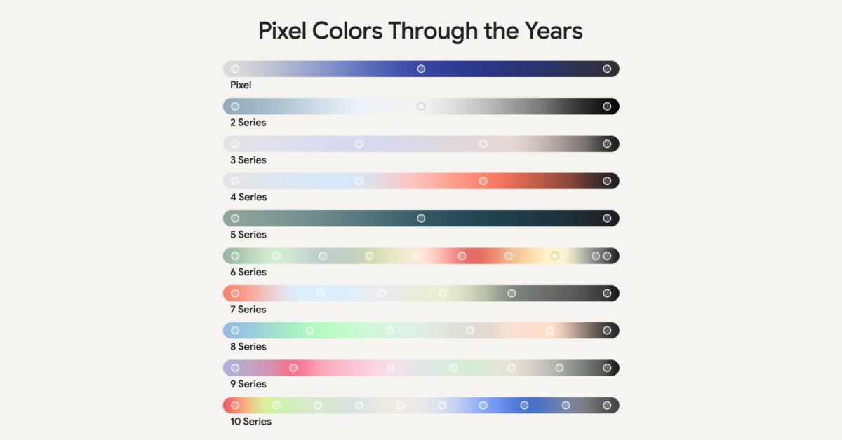
The Genesis of Distinctiveness: Bold Beginnings (Pixel 1-3)
In its nascent stages, the Pixel brand sought to carve out a unique identity in a crowded smartphone landscape. The original Pixel, with its iconic two-tone design, was offered in "Very Silver," "Quite Black," and the memorable "Really Blue." These playful, almost self-deprecating names, coupled with vibrant shades like "Kinda Blue" and "Not Pink" for subsequent generations, signaled a brand unafraid to be different. This era was characterized by bold statements, often featuring brightly colored power buttons contrasted against muted bodies, a clear differentiator from the monochrome offerings of competitors. It was a period where Google experimented with expressing personality through color, aiming to capture a demographic that valued quirky charm over corporate sleekness.
Maturation and Muted Sophistication (Pixel 4-6)
As the Pixel line matured, so too did its color palette. The shift became evident around the Pixel 4 and 5 series, moving towards more understated yet refined options. We saw the introduction of colors like "Oh So Orange," which, while still vibrant, felt more sophisticated than its predecessors, alongside "Just Black" and "Clearly White." This transition marked Google's growing confidence in its design language, relying less on overt playfulness and more on subtle elegance. The Pixel 6 era solidified this with a revamped design, introducing more distinct color blocking and hues like "Sorta Sunny," "Kinda Coral," and "Stormy Black," which hinted at natural elements and a more artistic approach to industrial design. This period reflects Google's ambition to be perceived not just as a software giant, but as a premium hardware manufacturer.
Embracing Nature and Nuance: The Current Aesthetic (Pixel 7-10)
The latest generations, from Pixel 7 through to the recently concluded Pixel 10 series, showcase Google's full embrace of nature-inspired tones and a refined, almost minimalist aesthetic. Colors like "Hazel," "Obsidian," "Snow," and more recently "Bay" and "Mint," reflect a conscious decision to ground the technology in the natural world. These colors are often muted, sophisticated, and designed to evoke a sense of calm and timelessness. This direction aligns with broader consumer trends favoring sustainability and subtle luxury, moving away from overtly flashy tech. The names themselves are less whimsical and more descriptive, signaling a confidence that the design itself carries the personality, rather than relying solely on clever nomenclature.
Beyond Aesthetics: The Strategic Implications of Color
But why does color matter so much? In a market saturated with similar form factors, color becomes a critical differentiator and a powerful tool for brand identity. Google's journey through its color palettes mirrors its evolution as a hardware company. Early bold choices helped establish a distinct presence; later, more sophisticated hues helped elevate the brand's premium perception. Each color choice is a calculated decision, influenced by market research, psychological impact, and the overarching vision for the Pixel brand. It's about creating an emotional connection, signaling innovation, or reinforcing a commitment to a particular design philosophy.
Looking Ahead: What Do Future Pixel Hues Hold?
With the Pixel 10 series now officially a wrap, anticipation for the Pixel 11 cycle begins. The current trajectory suggests a continued lean towards natural, perhaps even more earthy or biophilic tones, reflecting a broader industry push towards environmental consciousness and understated elegance. We might see Google exploring unique textures alongside colors, or perhaps even a return to bolder accents in a more refined manner. The infographic is not just a look back; it's a roadmap. It tells us that Google is intentional about its aesthetic choices, and the next palette will undoubtedly continue to tell the story of a brand that is constantly evolving, innovating, and, crucially, coloring its own path in the tech world.
As we await the next generation, one thing is clear: Pixel colors are more than just a paint job. They are a vibrant narrative, weaving together design, strategy, and user experience into a captivating tapestry that reflects the very soul of Google's hardware ambitions.