The Subtle Power of Pixels: Google's Latest Emoji Tweak and the Pursuit of Universal Digital Expression
In the ever-evolving landscape of digital communication, few elements are as ubiquitous and yet as nuanced as the emoji. More than just decorative icons, emojis have become an indispensable part of our daily interactions, conveying tone, emotion, and context in ways that plain text often struggles to capture. With the recent rollout of the Android 16 QPR3 beta update to Google Pixel phones, Google has quietly introduced a significant shift: a refresh of its emoji set, specifically aligning some designs to better match their iPhone counterparts. While seemingly a minor aesthetic update, this move carries profound implications for cross-platform communication and Google's broader design philosophy.
A History of Discrepancy and Design Philosophy
For years, the world of emojis has been a fascinating study in digital dialects. While the Unicode Consortium standardizes the meaning and encoding of emojis, the visual representation is left to individual platforms—Apple, Google, Samsung, Microsoft, and others—to interpret. This has led to a rich, often humorous, and occasionally confusing array of designs. A "grimacing face" on an iPhone might look slightly different from one on a Pixel, sometimes leading to misinterpretations in cross-platform chats, particularly with more subtle emotions.
Google, in particular, has a history of distinct emoji design. Remember the "blob" emojis? While beloved by some for their unique character, they eventually gave way to more human-like, standardized designs, acknowledging the need for greater universality. This transition underscored a growing industry trend towards more consistent visual language, yet subtle differences persisted, especially when comparing Android to the dominant iOS ecosystem.
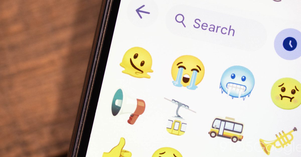
The Pixel's Path to Parity: What's Changing?
The Android 16 QPR3 beta update is more than just a performance tune-up; it's a visual recalibration. While the official gallery of all refreshed emojis is still emerging, reports indicate that specific designs are being tweaked to closely mirror those found on Apple's iOS. This isn't about wholesale copying, but rather a deliberate effort to achieve visual parity where previous discrepancies created friction.
Consider the impact: when an iPhone user sends a specific emoji expressing a nuanced emotion, a Pixel user will now see a much closer, if not identical, visual representation. This reduces the cognitive load of interpreting potentially different artistic styles and minimizes the risk of miscommunication. It's a pragmatic step towards a more unified digital language, putting user experience and clarity at the forefront.
Why Now? The Drive for Cross-Platform Harmony
Google's decision to align its emoji designs more closely with Apple's isn't a sign of creative surrender; it's a strategic embrace of interoperability. In an increasingly interconnected world, where users fluidly switch between devices and communicate across platforms, consistency is key. The "green bubble" vs. "blue bubble" debate in messaging is a testament to how deeply platform-specific elements can impact user perception and interaction. By standardizing emoji visuals, Google is chipping away at another layer of potential friction, making cross-platform conversations smoother and more intuitive.
This move also reflects a broader industry trend towards a more unified digital aesthetic, especially in core communication tools. As messaging apps become central to our lives, the focus shifts from unique platform branding to seamless user experience. Google, with its Android dominance, is demonstrating a commitment to this user-centric approach.
Looking Ahead: Beyond the Beta
The current emoji refresh is part of a "larger update to come," indicating that this beta release is just the tip of the iceberg. We can anticipate further refinements, possibly including new emoji additions from the latest Unicode standards, and a continued emphasis on visual consistency across the entire Android ecosystem, not just Pixel devices. This trajectory suggests a future where the visual language of emojis is less about platform distinction and more about universal understanding.
For developers, designers, and everyday users alike, this development is a positive one. It simplifies the design process, reduces potential misunderstandings, and ultimately enriches the expressive capacity of digital communication for everyone. Google's Pixel phones, often a testing ground for Android innovations, are once again leading the charge in defining a more harmonious digital future.
Conclusion: A Small Change with Big Impact
The updated emoji designs in the Android 16 QPR3 beta might seem like a minor detail in the grand scheme of a software update. However, in the nuanced world of digital expression, such details hold significant weight. By strategically aligning its emoji language with a widely accepted standard, Google is enhancing the clarity and universality of communication for millions of Android users. It's a subtle but powerful step towards breaking down digital barriers, fostering a more intuitive and globally understandable language, one pixel at a time.