Beyond the Glaze: iOS 26.2's Subtle Revolution in User Control and Apple's Evolving Design Philosophy
By NovaPress Editorial Team
In an era where digital interfaces increasingly shape our daily interactions, every pixel, every blur, and every degree of transparency holds significance. Apple, a company synonymous with meticulous design, has once again made a subtle yet impactful adjustment to its mobile operating system. With the recent release of iOS 26.2, iPhone users are now empowered to "dial down" the much-discussed "Liquid Glass" transparency effect on their Lock Screen's clock. While seemingly a minor tweak, this update from Cupertino signals a deeper evolution in Apple’s design philosophy and its ongoing response to user feedback.
Understanding Liquid Glass: Aesthetic Vision vs. Practicality
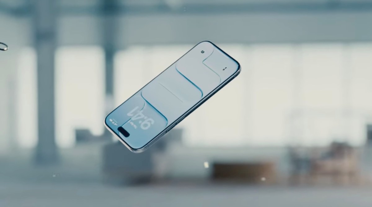
The "Liquid Glass" effect, characterized by its ethereal translucence and depth, has been a hallmark of modern iOS design, aiming to create a visually rich and immersive experience. It adds a sophisticated layer to the user interface, allowing background elements to subtly peek through, creating a sense of visual continuity. Apple's intention has always been clear: to craft an aesthetic that is both beautiful and functional, often prioritizing sleekness and minimalist elegance.
However, beauty can sometimes come at the cost of practicality. For some users, the inherent transparency of the Lock Screen clock, particularly when paired with certain wallpapers or under specific lighting conditions, could lead to readability challenges. The "glassy" nature, while visually appealing to many, could occasionally make the clock digits harder to discern, especially for users with visual impairments or simply those who prefer sharper contrast. The phrase "roll back Liquid Glass again," as noted by TechCrunch, hints at previous instances where transparency effects might have been toned down in other UI elements, indicating a pattern of Apple listening to nuanced user preferences.
The Power of Personalization: A New Era for Apple?
For years, Apple maintained a reputation for its tightly controlled design ecosystem, often dictating the 'best' user experience rather than offering extensive customization. While this approach has fostered a cohesive and intuitive platform, it has also occasionally clashed with users' growing desire for personalization. Recent iOS updates, including the significant Lock Screen redesign in earlier versions that introduced widgets and diverse font options, have shown Apple gradually loosening the reins.
The ability to adjust the Lock Screen clock's transparency is a direct extension of this trend. It acknowledges that "one size fits all" doesn't always apply to aesthetic preferences and accessibility needs. By providing a toggle for Liquid Glass, Apple empowers users to tailor their iPhone experience, striking a personal balance between modern aesthetics and optimal readability. This isn't just about a clock; it's about the principle of user agency within a carefully curated digital environment.
Beyond the Pixels: Broader Implications for UI Design
This seemingly minor update carries broader implications for user interface design as a whole. It underscores the delicate equilibrium designers must maintain between visual innovation and functional usability. While cutting-edge aesthetics can captivate, they must not compromise core user interaction.
The decision to offer a transparency slider for Liquid Glass suggests that Apple's design teams are not only pushing boundaries but also keenly observing user feedback loops. It highlights the importance of accessibility considerations in every design choice. What might be an aesthetic enhancement for one user could be an accessibility barrier for another. Providing options allows a broader range of users to engage comfortably with the technology.
Looking forward, this could foreshadow more granular controls over other UI elements across iOS. Could we see transparency adjustments for the Control Center, notification banners, or even the Dock in future updates? As operating systems mature, and user expectations for personalization rise, companies like Apple are increasingly finding value in allowing users to refine their digital canvases.
Conclusion: A Nod to User Choice
The iOS 26.2 update, with its specific focus on the Lock Screen clock's Liquid Glass effect, is more than just a software patch. It’s a quiet testament to Apple’s evolving philosophy—a recognition that while design principles are paramount, so too is the individual user's experience. By handing back a degree of control over a nuanced visual element, Apple reinforces its commitment to user satisfaction and accessibility, subtly revolutionizing the way we interact with our most personal devices. It reminds us that even the smallest adjustments can have the profoundest impact on daily digital life.